Mutation Microscope: making genomic predictions explorable
Mutation Microscope is a browser workspace for exploring how a change to one DNA letter could affect gene activity. It brings chromosome context, sequence inspection, comparative tracks, and source records into the same interface. The challenge was making the data easier to explore while keeping its limits visible.
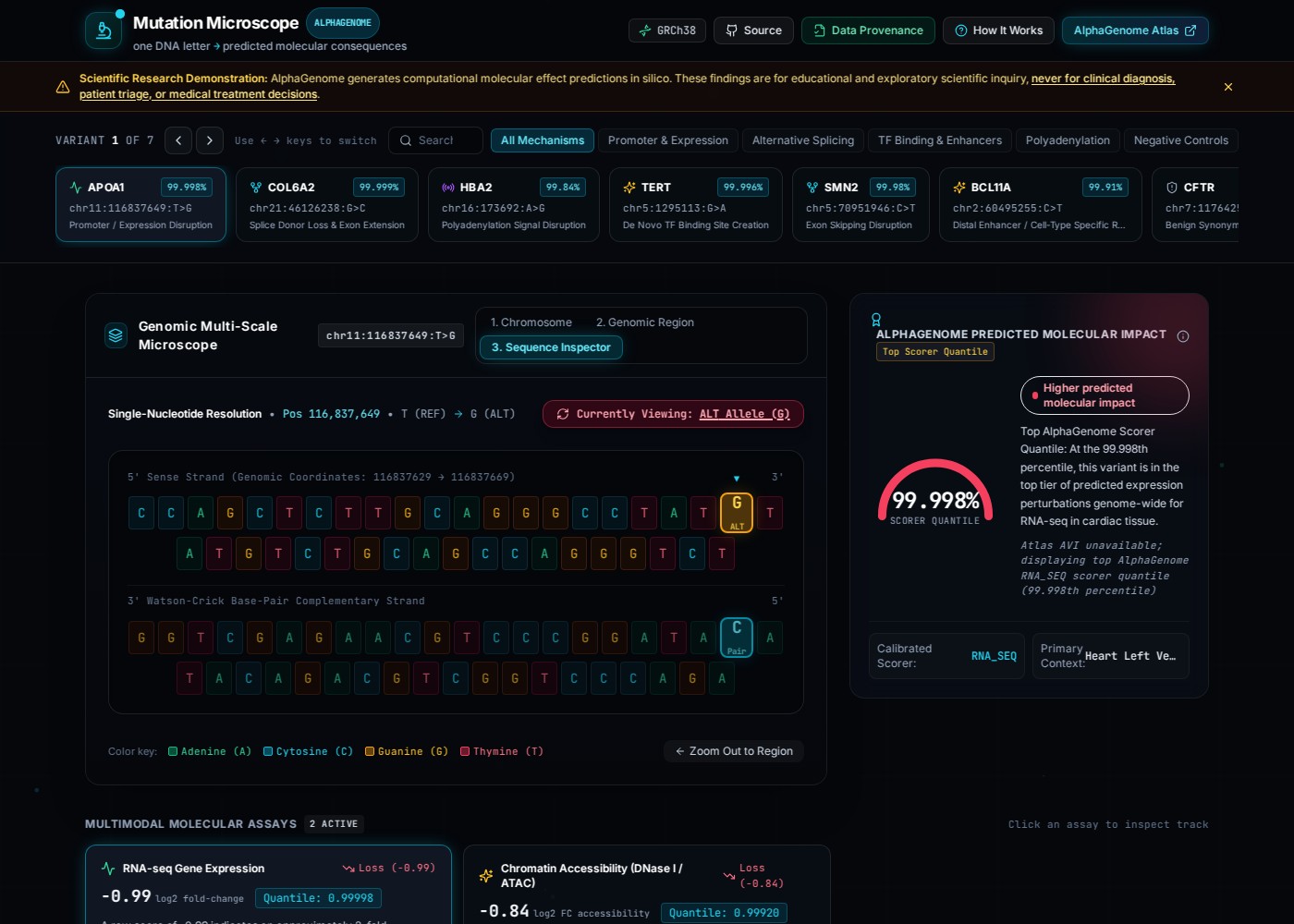
Google DeepMind’s AlphaGenome predicts molecular effects of DNA variation, including changes in gene expression and splicing. Mutation Microscope is the software I built around that research: a React and TypeScript interface, a Python data pipeline, and a way to inspect where the displayed information came from.
A coordinate and a high score only tell part of the story. Where is the variant on the chromosome? What changes in the sequence? Which signal differs between the reference and alternate alleles? What kind of evidence supports that view?
The microscope gives those questions three scales. The chromosome view locates the variant within the larger structure. The genomic-region view shows gene organization, exons, strand direction, and regulatory landmarks. The sequence inspector narrows the view to the changed base and its complementary strand. Switching REF and ALT makes the difference visible without losing the surrounding context.
The comparison continues in the tracks below. Reference and alternate signals share a genomic axis, and a scrubbing crosshair reports their values alongside ALT − REF. Splicing examples add Sashimi arcs to show junction signals. Where the dataset provides them, substitution heatmaps let a visitor compare the displayed effects of A, C, G, and T at nearby positions.
These are coordinated views of the bundled data. Clicking a base or selecting an assay does not run a new prediction. Changing the variant updates the shared state and selects that variant’s first available assay, so the inspector, impact panel, and tracks stay on the same example.
The public dataset contains seven examples: APOA1, COL6A2, HBA2, TERT, SMN2, BCL11A, and a CFTR educational control. Visitors can search or filter that set and use arrow keys to switch examples. A search with no matches shows an empty state and a reset action. It does not imply that the application searched the whole genome.
The more demanding work was deciding what the visuals were allowed to claim.
Some source records contain exact published values or genomic references. Other values are calculated from those records. The continuous tracks for the six non-control examples are labeled as reconstructed; the CFTR control’s tracks are illustrative. A smooth curve should not make an approximation look like a freshly retrieved model output.
I made that distinction part of the data model through six evidence classes:
| Evidence class | What it means |
|---|---|
live_api | Retrieved by the developer pipeline from AlphaGenome, with retrieval metadata. |
atlas | Retrieved directly from AlphaGenome Atlas. |
published_exact | Recorded as an exact value or reference from a cited source. |
derived | Calculated or transformed from source values. |
reconstructed | Approximated from a published plot or other source without its exact numerical points. |
illustrative | Constructed to explain a concept or demonstrate a control. |
The Data Provenance dialog exposes source records, track classifications, transformation notes, and dataset-generation metadata. It lets a visitor inspect the evidence behind the selected example instead of relying on a general claim that the application uses scientific data. Those labels document the repository’s attribution; they still need to be checked against the original sources.
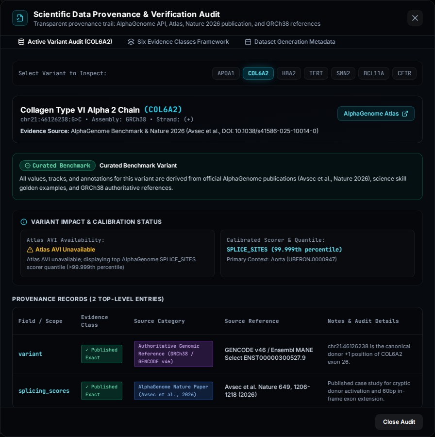
Score naming needed the same care. None of the current examples has a confirmed composite Atlas AVI score. The impact panel therefore identifies the displayed scorer quantile and says that AVI is unavailable. A prominent percentage needs its metric and context attached; it should not invite a visitor to read it as a probability of disease.
The public application loads static JSON at build time and needs no model credentials or inference backend. An optional developer-side pipeline can request scalar scores from AlphaGenome. That enrichment leaves the existing tracks, sequences, and other curated structures under their original provenance, and successful enrichment is recorded as a mixed dataset. The committed snapshot currently records zero live-enriched variants.
Separating the declarative records, generator, and validator makes that boundary easier to inspect. Validation checks allele consistency, complementary sequences, track lengths, delta arithmetic, score ranges, and provenance metadata. It cannot establish that a reconstructed curve accurately represents a published experiment or that a biological explanation is correct.
Browser checks also exercised all three zoom levels, REF/ALT switching, variant selection, provenance metadata, modal dismissal with focus restoration, and the empty search state. Those checks establish the inspected software behavior. They do not validate AlphaGenome’s predictions or turn this educational workspace into a diagnostic tool.
The next useful work is an external source audit of individual examples and a usability check with someone encountering the data for the first time. I’d want to know whether they can distinguish a published scalar value from a reconstructed track and explain what the gauge actually measures.
That is the lesson I’d carry into another AI product: making an output easier to explore also means making its evidence easier to question.
Explore the live demo ↗ · Repository ↗ · Evidence definitions ↗ · Architecture ↗